Video Tutorial
Step 1
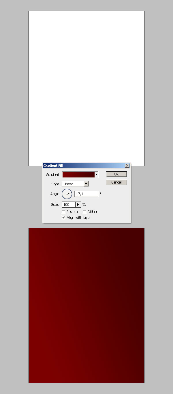
Open Photoshop and create a new document 1200px width by 1600px height, with an RGB color, and 72dpi. Then go to Create a new fill or adjustment layer in the Layers palette, select the Gradient Option and set the colors from #7D0000 to #480000. Set the angle value to 17 - 20º and hit OK.
Step 2
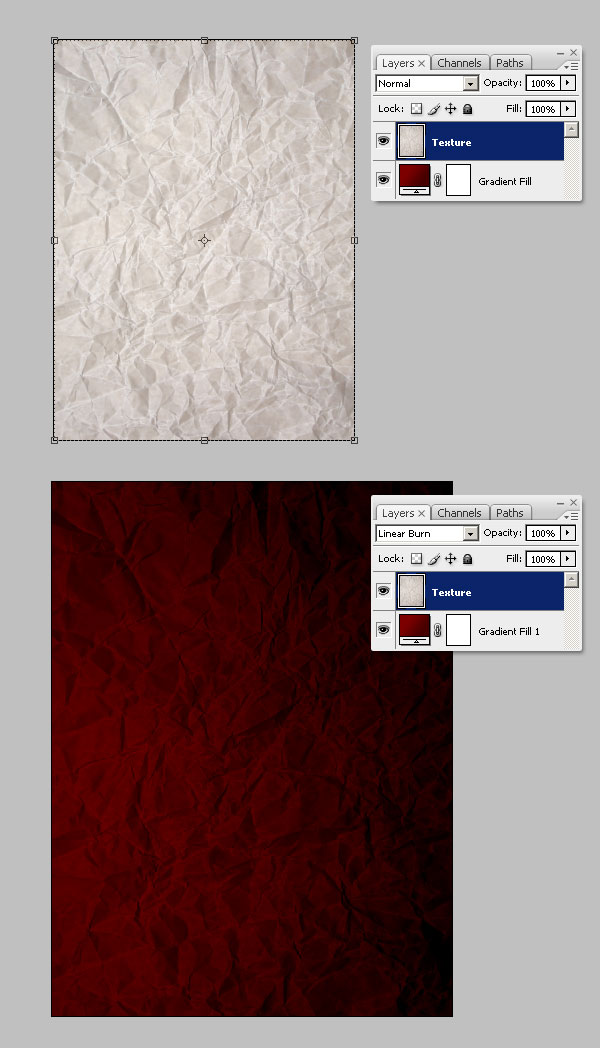
Now, add a texture over the background, grab this image and paste it into a new layer named "Texture" above the Gradient layer. Then, change its blending mode to Linear Burn.
Step 3
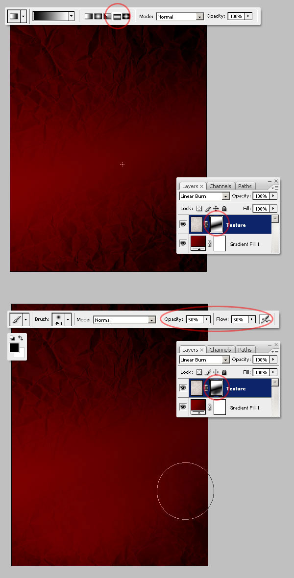
Select the "Texture" layer. Go to Layer > Layer Mask > Hide All. After selecting the layer mask, grab the Gradient Tool (G), set the gradient colors to Black to White (#000000 - #FFFFFF) and set the Reflected Gradient Option on the top panel.
Fill the layer mask with a slightly oblique Gradient (see image below) and use a big Black Brush (Opacity and Flow at 50%) to hide a little bit of the "Texture" layer's bottom right.
Step 4
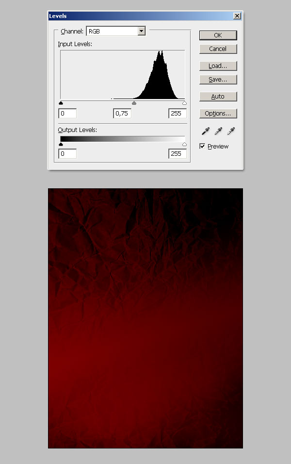
Now, increase the contrast of the "Texture" layer by adjusting its Levels (Command + L), as shown below.
Step 5
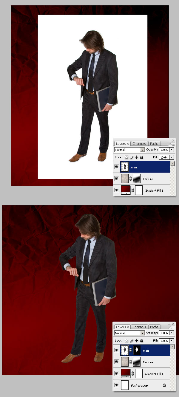
Let's add one of the main objects in the design, this guy looking at his watch. Paste the image into a new layer named "man," and extract his shape from the white background.
Step 6
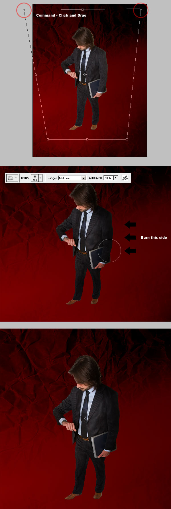
Select the "man" layer and chose the Move Tool (V), and ensure the Show Transform Controls is checked in the Options Panel. Next, Command-click the top-left corner and drag it a little bit to the left, then repeat that but with the right corner this time. This will create a perspective illusion, like if we were looking at the guy from above. Then grab the Burn Tool (O) and darken a little bit of the guy's right side.
Step 7
I'll try this experimental way to increase the man's color and contrast. Duplicate the "man" Layer, and go to Filter > Other > High pass, set the Radius to 10px, and hit OK. Now change "man copy" Blending mode to Overlay. Then, merge both "man" layers and Dodge the left side of the resultant layer a little bit.

Step 8
Now, we'll add a projected shadow. Duplicate the new "man" layer, put the copy behind the original, and name it "Shadow." Move it a little bit to the right.
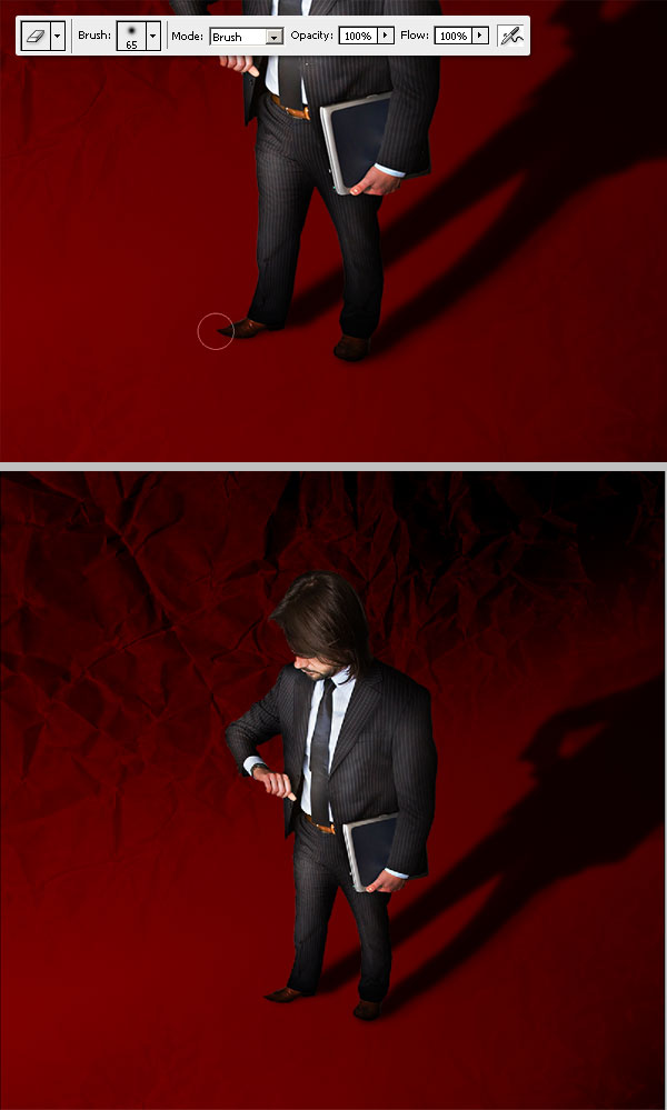
Using the Free Transform options, Command-click the middle-top control point of the "Shadow" layer and move it to the right, then play with the transform options to make the shadow look like the image below. Next, go to the Hue/Saturation window (Command + U) and turn down the "Shadow" layer's Lightness to -100.

Step 9
Select the "Shadow" layer, then go to Filter > Blur > Gaussian Blur and set the radius to 5px. Then duplicate the "Shadow" layer, make the copy bigger than the original and reduce its Opacity to 25%. Finally, change the "Shadow" layer's Opacity to 75% and merge both.

Step 10
Select the Eraser Tool (E) and delete the extra shadow in front of the man's feet.
Step 11
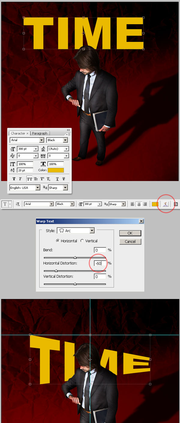
Next, we'll add the main text layer. Using the Type Tool, type the word "TIME" using Arial Black for the typeface. Set it to a Size of 300pt and place it below the "Shadow" layer.
Select the Type Tool and on the Options panel press Create Warped Text. In the Dialog, set the Style as Arc, Bend to 0%, Horizontal Distortion to -60% and vertical Distortion at 0%. I'm using some guides by the way to mark the horizontal middle point.
Step 12
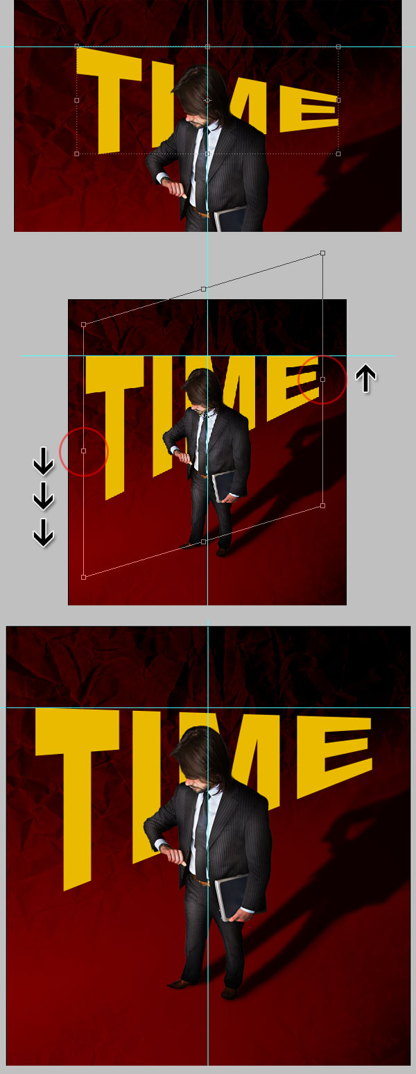
Next we'll skew the text just a little bit. Using the Move Tool select the "Time" text layer, and activate the Free Transform Options (Command + T), then Command-click the left-middle Transform Point, and move it a little bit down. Now Command-click the middle-right point, but this time move it up a little bit. Try to get something like the image below. Once you're happy with the result, hit the Return key or Commit the transformation from the Options Panel.
Step 13
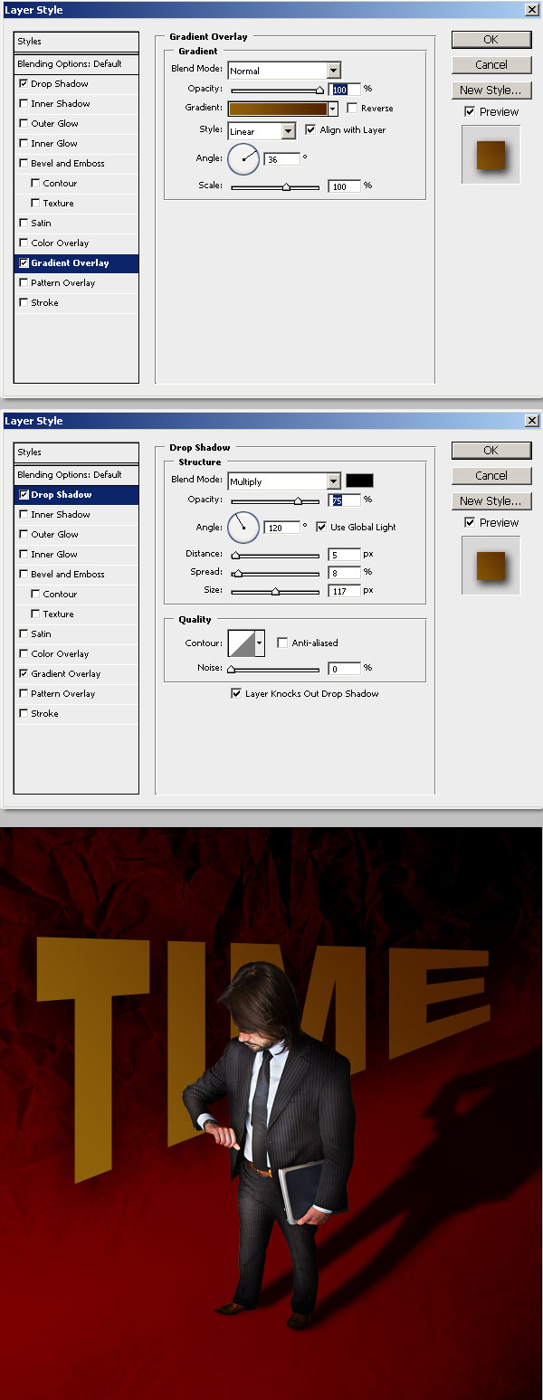
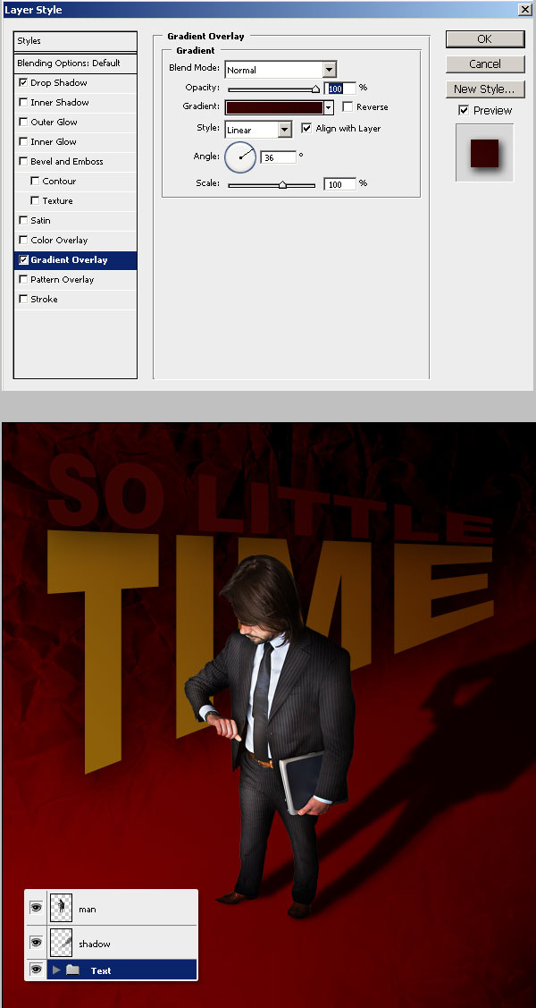
Let's work a bit more on the "Time" text layer. Add the following Layer Styles: a Gradient Overlay (#8D6009 to #522300) with an Angle of 36º. And a full, big Drop Shadow (set the values shown below).
Step 14
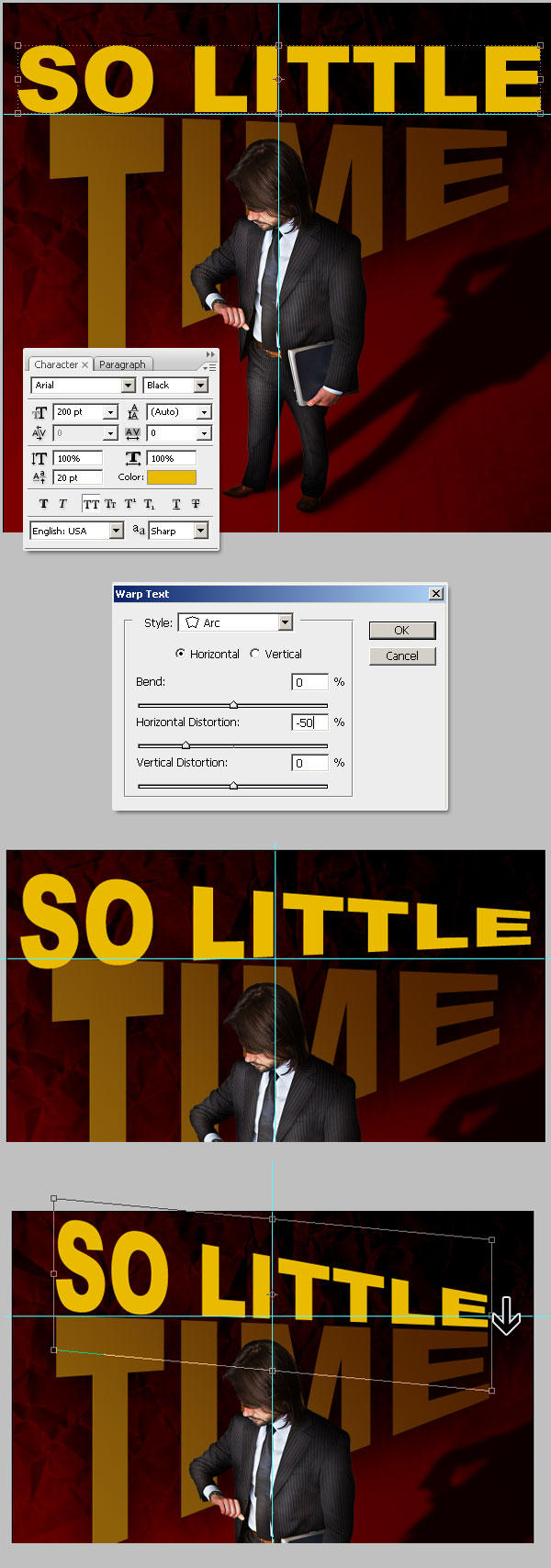
Add another text layer, type the words "So Little" and place it above the "Time" layer. Warp it using the Arc Style and set Horizontal Distortion to -50, commit the distortion, and hit Command + T to show the Free Transform Options. Command-click the middle-right control point and move it a little bit down. Try to match the text baseline with the "Time" layer's top line. Then, Commit the transform.
Step 15
Next, copy the "Time"Layer Styles (Alt-click or Right-click over the layer miniature > Copy Layer Style). Select the "so little" layer and paste the layer style (Alt-click or Right-click over the layer miniature > Paste Layer Style). Then, Double-click over the Gradient Overlay style of the "so little" layer, and adjust the gradient colors to: #3A0303 - #2A0000. Hit OK, and see how it looks.
It's very important to have a kind of dark color on the gradients because we'll light them by using a texture forward. To finish this step, grab the two layers and put them in a Group named "text." A quick way of do it is to Click over the "Time" layer, then Shift-click the "so little" layer to select both, and hit Command + G to group them.
Step 16
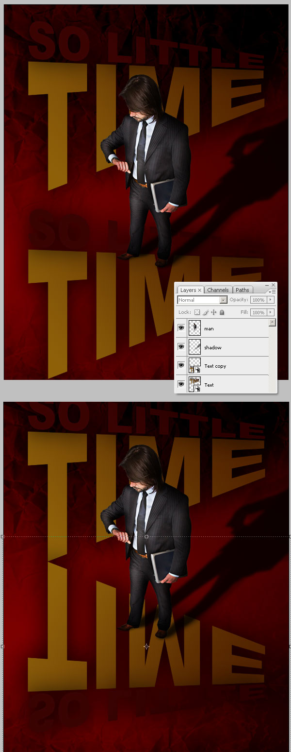
Now we'll create the good old text reflection. Convert the "Text" folder into a Smart Object (Right-click over the Folder miniature and select Convert to Smart Object). Then Duplicate the Smart Object, you can use the Move Tool, select the "Text" Smart Object, hold down the Alt key and drag a copy. Select the Copy and go to Edit > Transform > Flip Vertical.
Step 17
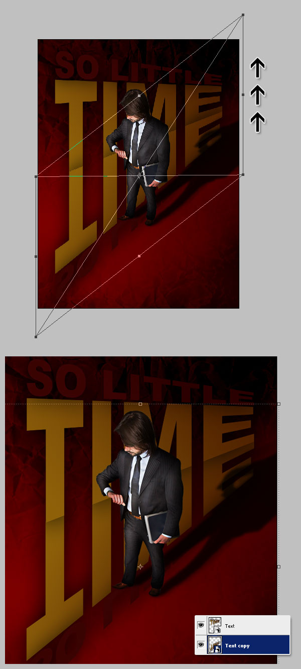
Select the "text copy" layer, hit Command + T to enable the free transform tools, click over the right middle handler and move it up. Try to match the baselines. Finally, move the "text copy" Smart Object below the "text" Object in the Layers Palette.
Step 18
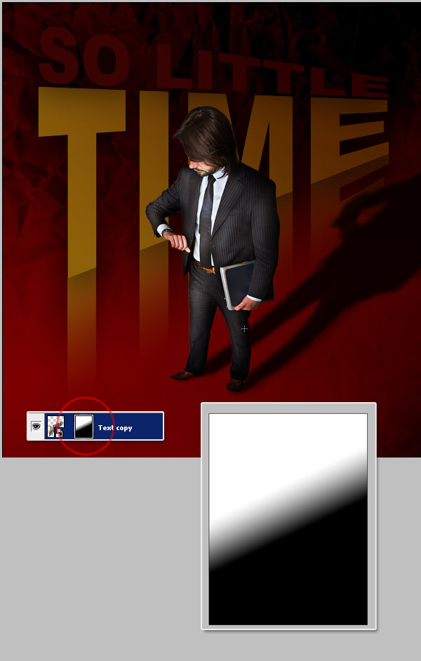
Select the "Text copy" layer and go to Layer > Layer Mask > Hide All. Then Fill the layer mask with a diagonal Black to White gradient, as shown below.
Step 19
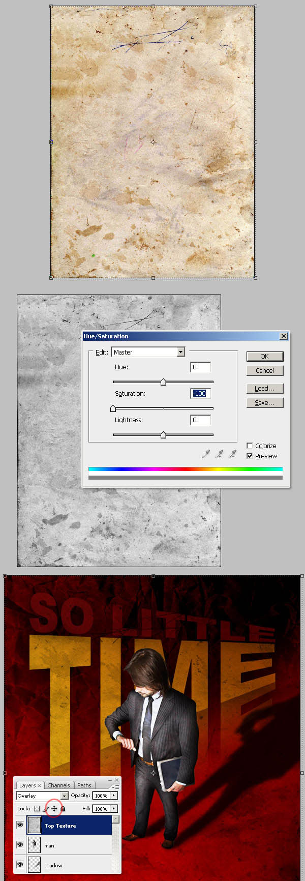
Here comes the light, grab this picture of a nice piece of grunge paper and paste it into a new layer above everything and name it "Top texture."
Hit Command + U to adjust the Hue / Saturation values and turn down the Saturation amount to -100. Now change the "Top texture" Blending Mode to Overlay. Lock the "Top texture" layer by clicking in the tiny cross arrows of the Layers Palette; if you don't do that, you'll be unable to click/select any other layer below it.
Step 20
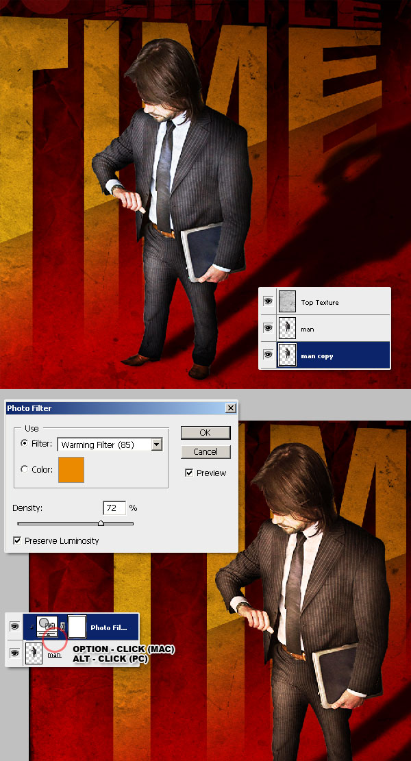
Duplicate the "man" layer. Since the man isn't matching the colors of the background, nor the text, we must adjust his colors. Select the original "man" layer and go to Layer > New Adjustment Layer > Photo Filter, select Warming Filter 85 from Filter options, and hit OK. You'll see that the Adjustment layers are applied to the entire document. You must create a clipping mask to apply the adjustment just for the "man" layer. You can do this easily by Alt-clicking in the line between the Adjustment Layer and "man" layer.
Step 21
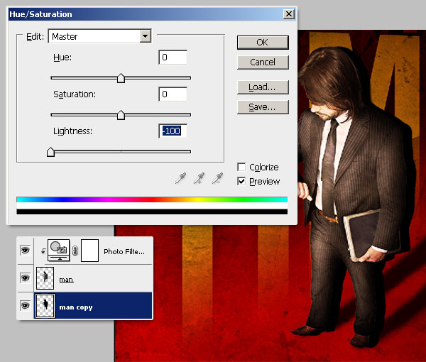
Select the "man copy" layer and move it some pixels to the right. Now go to Hue/Saturation options (Command + U) and turn down the lightness to -100.
Step 22
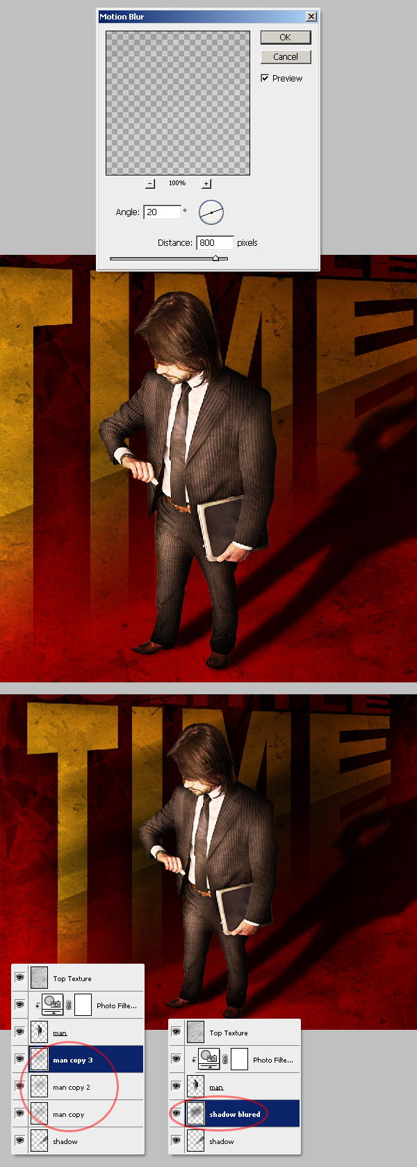
Next, we'll blur the black silhouette. Select the "man copy" layer and go to Filter > Blur > Motion Blur, set the distance to 800 pixels and the angle to 20º, then hit OK.
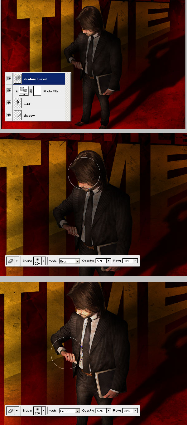
Now, duplicate the "man copy" layer two times, you must have something like the bottom of the image below. Then select the three "man copy X" layers (Shift-click the layer miniatures to select) and merge them by pressing Command + E. Name the resultant layer "shadow blurred."
Step 23
Move the "shadow blurred" layer above the Photo Filter layer. Then use a big, soft Eraser (E) with Opacity and Flow set to 50% to delete the shadow over the man´s face and body.
Step 24
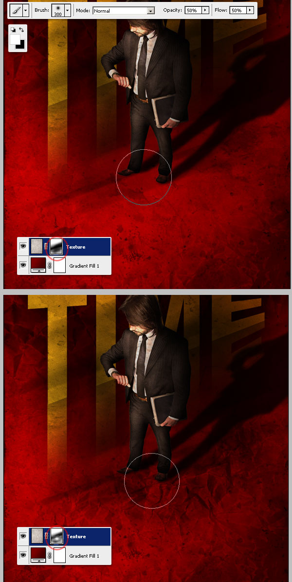
Following, we'll reveal a little bit of the paper texture of Steps 2 and 3. Select the "Texture" layer in the layers palette, and click over the Layer Mask Miniature.
Select the Brush Tool (B), and use a big, soft brush with a Hardness of 0%, Opacity and Flow at 50%, and set the foreground color to White (#FFFFFF). Now paint some spots below the man's feet.
Step 25
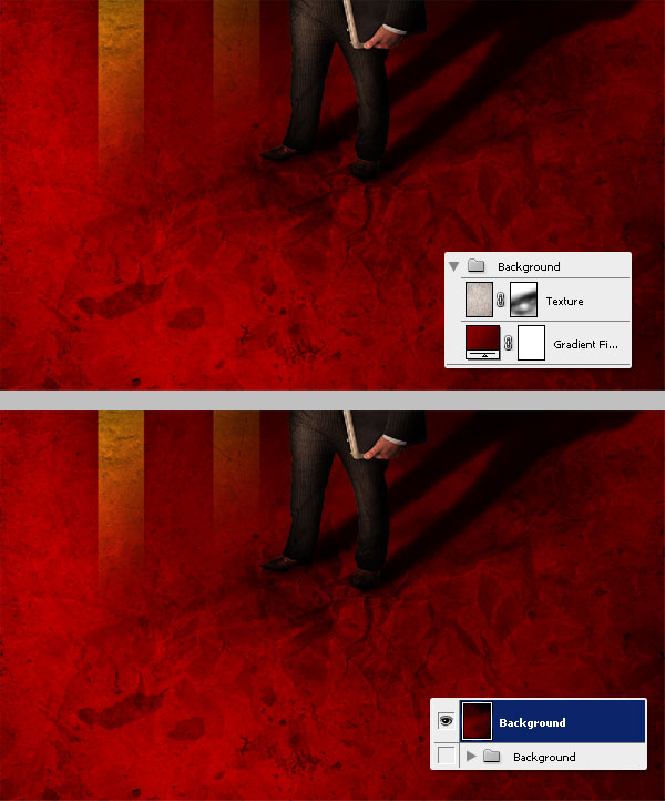
Put both "Texture" and "Gradient fill" layers into a folder named "Background." Duplicate the folder and Merge the copy. Always leave a copy of the first layers in case you'll need to rollback later.
Step 26
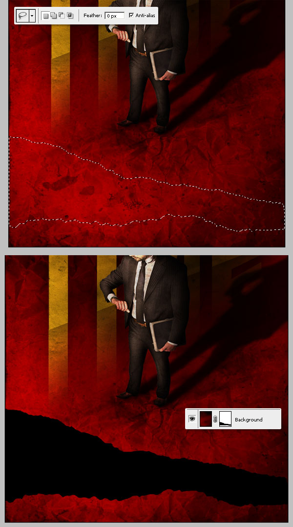
Now we'll cut a piece of the background. Use the Lasso Tool to make an irregular selection. Then go to Layer > Layer Mask > Reveal All. In the layer mask, use the Paint Bucket Tool (G) to fill the selection with Black (#000000). I'm adding a temporary black fill layer below the "Background" layer to see how it looks.
Step 27
Tired yet?... neither am I. now open this picture, select just the newspaper and paste it into a new Folder below the "Background" layer and name it "Newspaper."
Place one more copy of the newspaper, but rotate it some degrees to make it look different than the first instance. Use the Burn Tool (O) to Burn some parts of the paper sheets, making some areas darker. Now Merge the "Newspaper" folder (Command + E).

Step 28
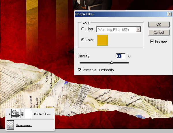
Since the paper's colors aren't matching the scene, go to Layer > New Adjustment Layer > Photo Filter to adjust them. Select a Color Filter (#E4AD04) with a Density of 66%. Apply it just to the "Newspapers" layer by creating a Clipping Mask (Alt-clicking between both layers).
Step 29
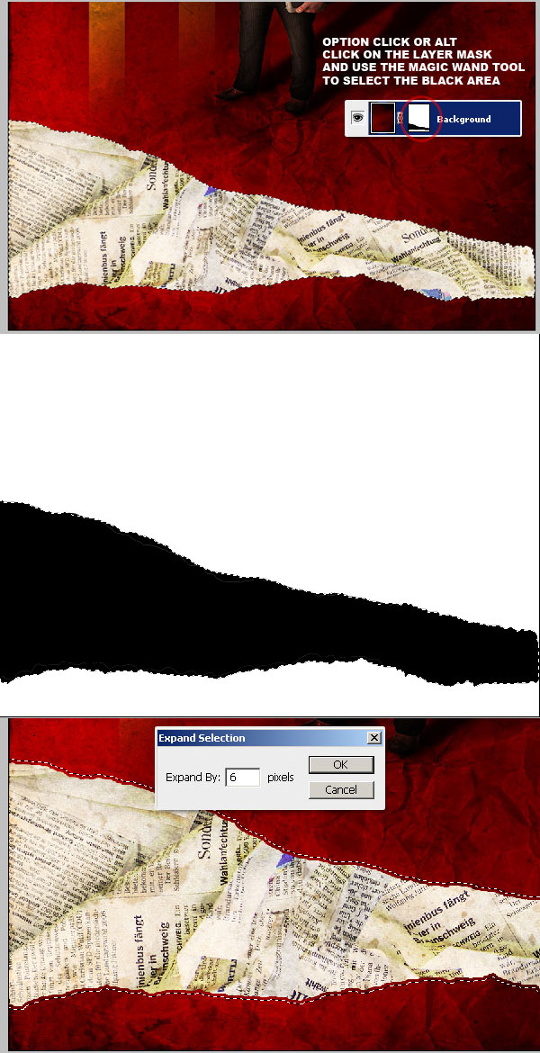
Now we'll create a torn effect on the paper. First, hold the Alt key and Click the Layer mask of "Background" layer, then use the Magic Wand Tool (W) to select only the black area of the mask.
Click over the background layer again to make it visible once more. Then, go to Select > Modify > Expand and expand it by 6 pixels. Click over the "Background" Layer miniature and move to the next step.
Step 30
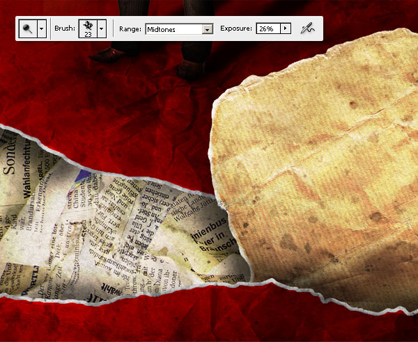
Press Command + U to show the Hue/Saturation options, turn down the selection's Saturation to -100 and hit OK. You'll see that the expanded selection is gray now. Select the Dodge Tool (O) and use an irregular Brush (Chalk is perfect), set the Exposure to 25%, and apply the Dodge to the gray border randomly.

Step 31
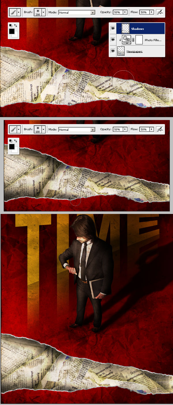
To increase the realism of the background papers, we'll add some shadows over the "Newspapers" layer. Create a new layer above the Newspaper's Photo Filter and name it "Shadows."
Use a big Black Brush (B) with a size of 200px, Hardness of 0%, and Opacity and Flow set to 50%, and paint some shadows near the torn paper. You can play with the Brush sizes to improve the effect.
Step 32
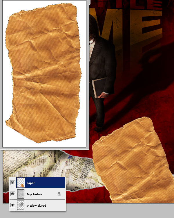
Open this picture, extract the paper shape and paste it into a new layer named "paper" above the "Top texture" layer. Place the piece of paper at the bottom right of our design.
Step 33
Now, we'll create the illusion of this paper coming from behind the torn paper. Alt-click the "Background" layer's Layer Mask. Then use the Magic Wand Tool to select just the Black area, and click the "paper" layer miniature to select it.
Next, grab the Lasso Tool, hold down the Shift Key to add the selection to the existing one, then make a selection covering the entire paper shape. Finally, invert the Selection (Command + Shift + I) and Delete it.
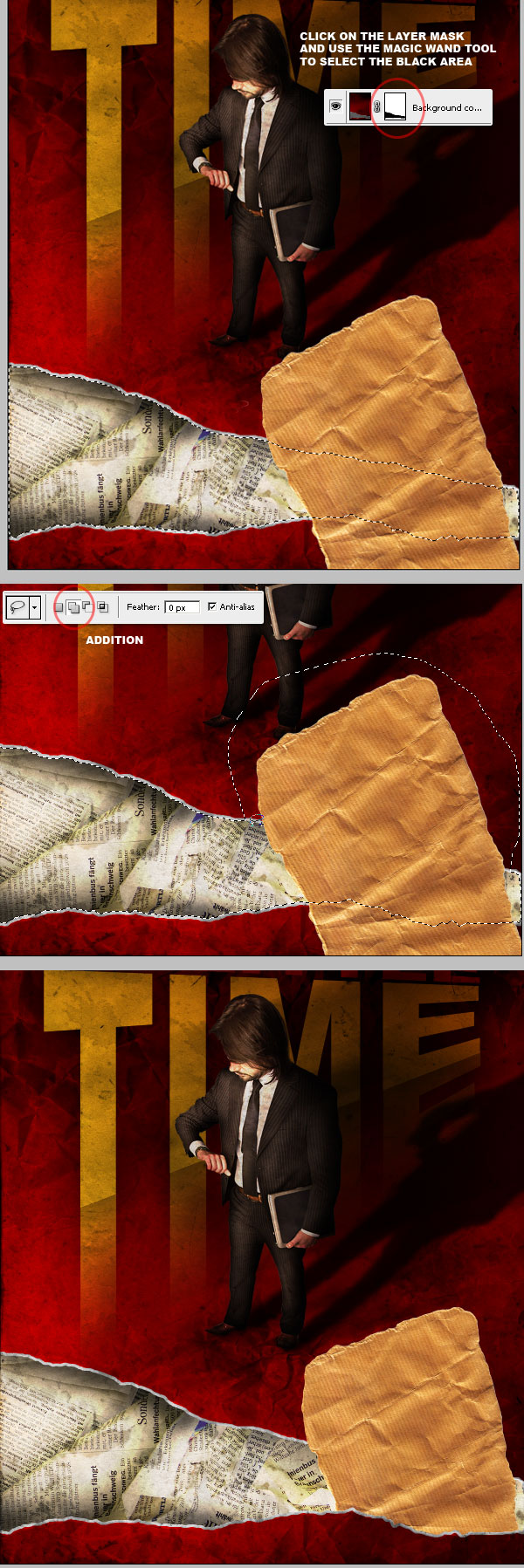
Step 34
Let's add some shadows. Create a new Layer above the "paper" layer and name it "shadows." Put both into a new Group named "Paper." Then using a big Soft Brush, paint some shadows at the bottom. Repeat the previous Selection steps (Step 33) in order to delete the paper's extra shadow.
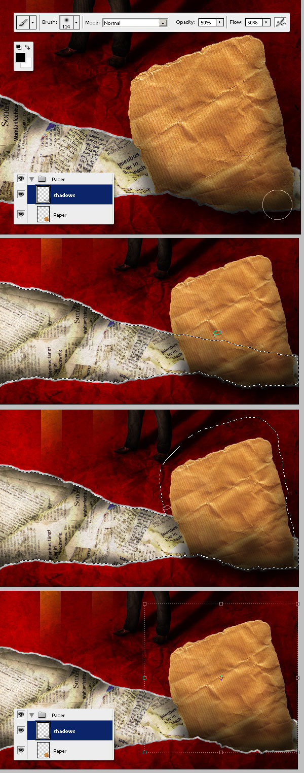
Step 35
Now create a new layer below the "paper" layer, name it "shadows 2," and paint some black shadows behind the paper to create a pop effect.
The shadow of the paper is intended to be flipped if you compare it with the man's shadow, just because this is a constructivist inspired composite, and I wanted to create the illusion that the man is part of the background paper sheet.
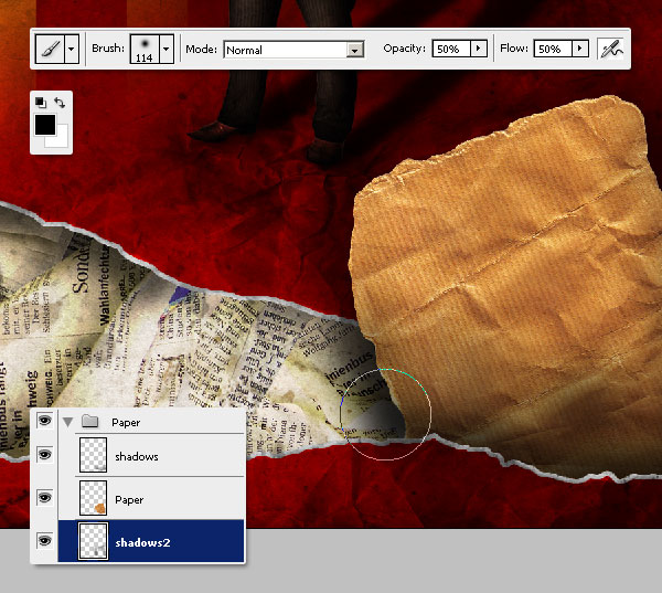
Step 36
We're close to being finished. Select the "paper" layer and adjust its Saturation by -25. Then, in the Layers Palette, grab the entire "Paper" and Drag it just above the "Background" layer.
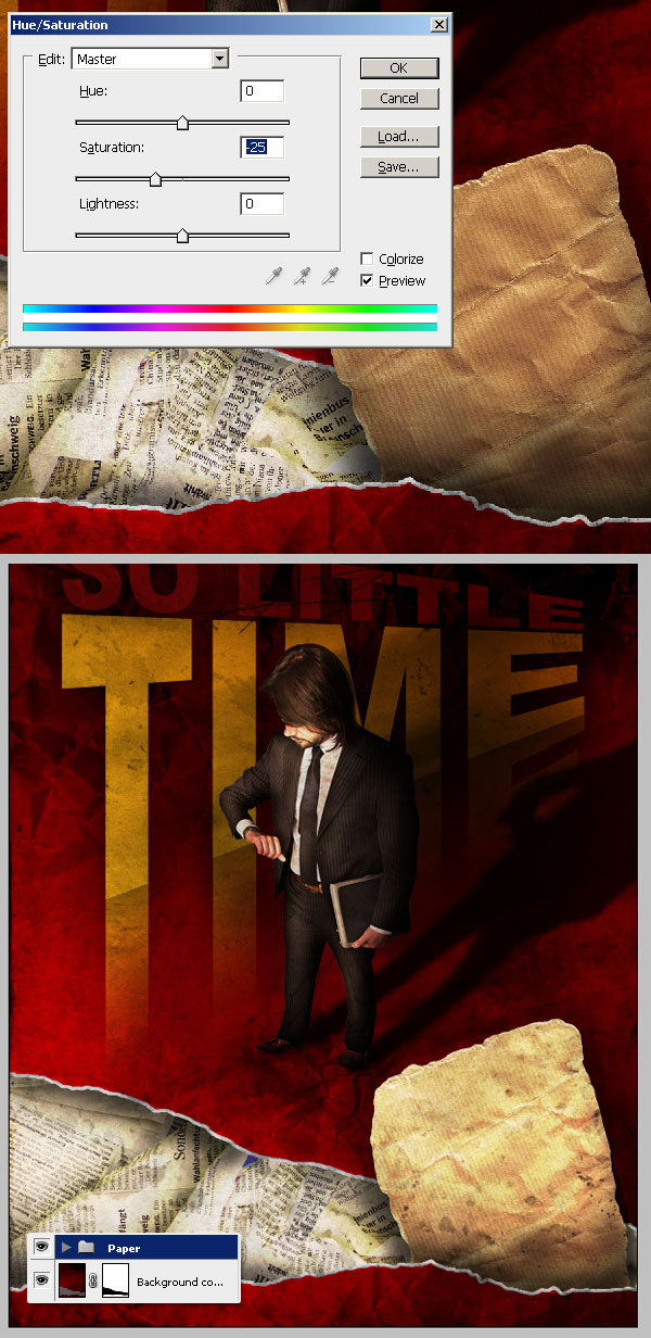
Step 37
Using an irregular Brush, Dodge the "paper" borders just a little bit to create a soft torn effect.
Step 38
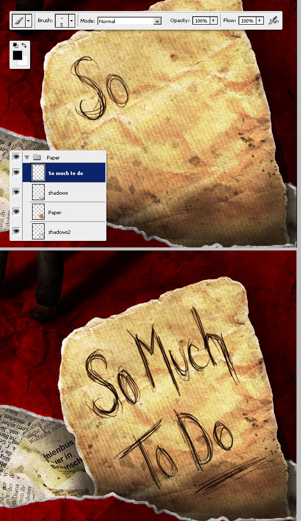
Create a new layer named "so much to do" and use a small Brush to draft some irregular text on it. I'm using my tablet for this, but you can either use your mouse or any hand written Font.
Conclusion
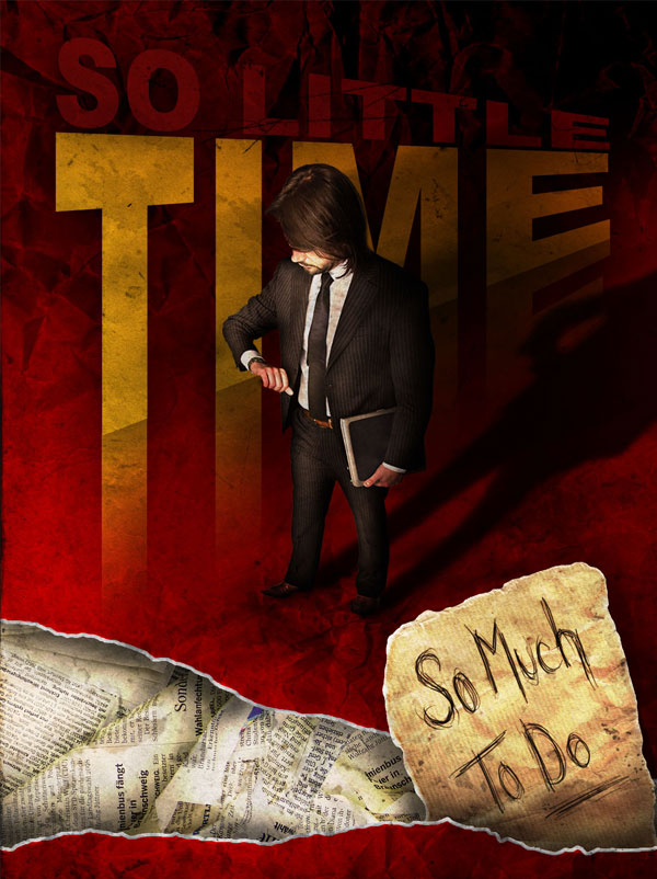
Here we've got the final piece. I hope you liked this one and don't hesitate asking questions if you encounter some confusing or overwhelming steps. Have fun!

original link to author






0 comments:
Post a Comment